The Psychology Behind Why Users Click: Cognitive Biases in UI Design
How the human brain shapes every interaction and what designers must do about it
The Button Nobody Clicked - and Why
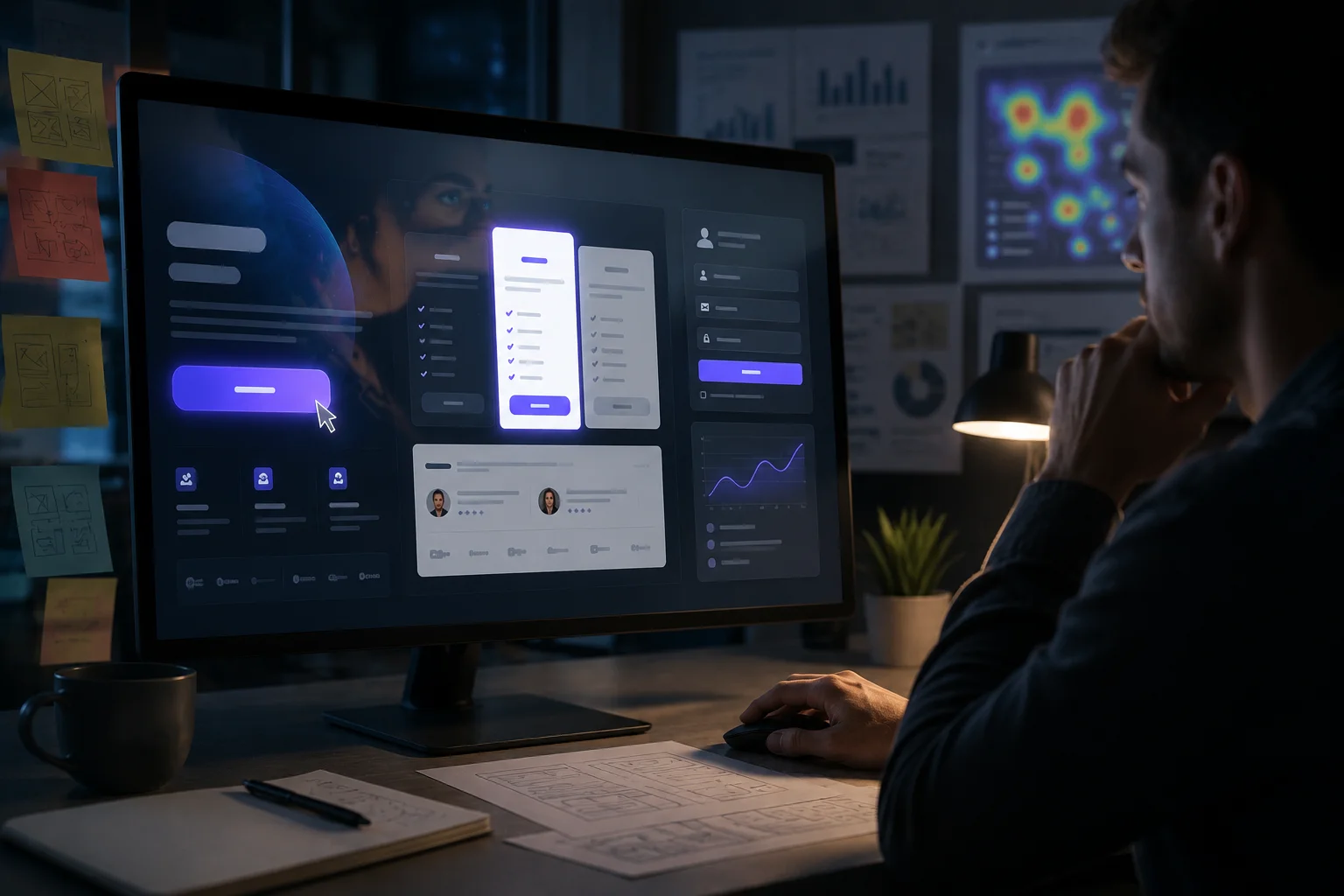
A team ships a new feature. The button is perfectly placed, the copy is clear, the colour passes accessibility contrast checks. Yet analytics show barely anyone taps it. The engineers check the code, nothing is broken. The designer stares at the screen. What went wrong?
The answer is rarely the code. It is the brain. Every single decision a user makes — where to look, what to click, whether to trust a page, when to abandon a form — is shaped by deep cognitive shortcuts called biases. These are not flaws in the user. They are features of human cognition, evolved to help us make fast decisions with limited mental energy. As UI/UX designers, ignoring them is designing blind.
This post breaks down the cognitive biases that most directly affect digital interfaces, with concrete real-world examples and design takeaways that can be applied.
"Users do not make rational decisions. They make fast ones. Your design either works with that or against it."
What Are Cognitive Biases?
Cognitive biases are systematic patterns of deviation from rational judgment. Psychologists Daniel Kahneman and Amos Tversky spent decades documenting them and stated that our brains run on two systems:
- System 1: Fast, automatic, emotional, and effortless.
- System 2: Slow, deliberate, and logical.
When users interact with an interface, System 1 is almost always driving.
This has a profound implication. Users are not reading your interface. They are making snap judgments based on shape, colour, position, and familiarity before a single word has been consciously processed. UI design is, at its core, the art of shaping those snap judgments.
6 Cognitive Biases Every Designer Must Understand
1. The Anchoring Effect - First Numbers Win
The first piece of information a user encounters disproportionately influences every judgment that follows.
- Real-World Example: Spotify shows its Premium plan first at a higher price tier before showing the free option. The free tier suddenly feels more generous by comparison. Pricing pages almost universally put the most expensive plan on the left for this exact reason.
- Design Takeaway: Always control what users see first on a page. Lead with the strongest value metric, an impressive statistic, or the recommended plan. The first anchor shapes the entire conversation.
2. The Von Restorff Effect - Isolation Draws the Eye
When multiple similar objects are present, the one that differs from the rest is most likely to be remembered and acted upon.
- Real-World Example: Every SaaS pricing page highlights one plan with a coloured border, a "Most Popular" badge, or a larger card.
- Design Takeaway: Use deliberate contrast for the primary CTA. Restraint in design is not timidity — it is directing attention.
3. The Peak-End Rule - Only Two Moments Define the Whole Experience
People do not remember an experience as an average of all its moments. They remember it as the emotional peak (positive or negative) and the ending. Every moment in between is largely forgotten.
- Real-World Example: Duolingo ends each lesson with a celebratory animation — confetti, a streak counter, and an encouraging message.
- Design Takeaway: Design the endings intentionally. Those moments carry enormous weight.
4. Hick's Law - More Choices, More Paralysis
Hick's Law states that the time to decide increases logarithmically with the number of choices available.
- Real-World Example: Amazon's checkout flow ruthlessly strips navigation, recommendations, and distractions from the page the moment a user enters checkout. The fewer decisions required, the faster the purchase completes.
- Design Takeaway: Audit the screens for decision fatigue. Showing only what is needed at each step is one of the highest-leverage techniques in UX.
5. The Mere Exposure Effect - Familiarity Breeds Trust
People develop a preference for things simply because they have encountered them before. Repeated exposure alone increases perceived credibility, attractiveness, and trustworthiness.
- Real-World Example: Digital buttons that looked like physical buttons were trusted immediately because of prior exposure to the real-world equivalent.
- Design Takeaway: A "creative" checkout flow that abandons familiar patterns will almost always underperform a conventional one, even if it looks more impressive in a portfolio.
6. The Zeigarnik Effect - Incompleteness Creates Compulsion
Russian psychologist Bluma Zeigarnik found that people remember unfinished tasks far better than completed ones and feel psychological tension until tasks are resolved.
- Real-World Example: LinkedIn's profile completion bar is a masterclass in the Zeigarnik Effect. "Your profile is 68% complete" is an open loop that a significant portion of users cannot resist closing.
- Design Takeaway: The closer users feel to the finish line, the more committed they become.
The Ethical Dimension: Persuasion vs. Manipulation
Understanding cognitive biases gives designers enormous power, and that power has a dark side. The same principles that improve clarity and reduce friction can also be used to deceive users. These are called dark patterns, and they are increasingly the subject of legal scrutiny, regulatory action, and public backlash.
The distinction between ethical persuasion and manipulation comes down to one question: Does this design help the user achieve their goal, or does it coerce them into achieving ours at their expense?
Ethical use of cognitive bias looks like:
- Using the Von Restorff Effect to highlight the action that genuinely best serves most users.
- Using the Zeigarnik Effect to help users complete a form they started and genuinely want to finish.
- Using social proof to surface authentic user reviews that help people make better-informed decisions.
Manipulation looks like:
- Fake countdown timers that reset when they reach zero.
- Pre-ticked consent boxes buried in a sign-up flow.
- "Confirm shaming" — labelling the decline option as "No thanks, I don't want to save money".
The best designers treat ethical design not as a constraint but as a quality standard. Users who feel manipulated leave and do not return. Trust, once broken in an interface, is extraordinarily hard to rebuild.
Conclusion
The next time a user clicks something, abandons a form, trusts a page they have never seen before, or chooses the middle pricing tier almost every time — it is not random. There is a cognitive mechanism behind each of those moments. The designer who understands those mechanisms does not just make interfaces that look good. They make interfaces that work with the grain of human cognition, rather than against it. That is the difference between design that ships and design that performs.